This Is Sort Of A Silly Chart, CBS

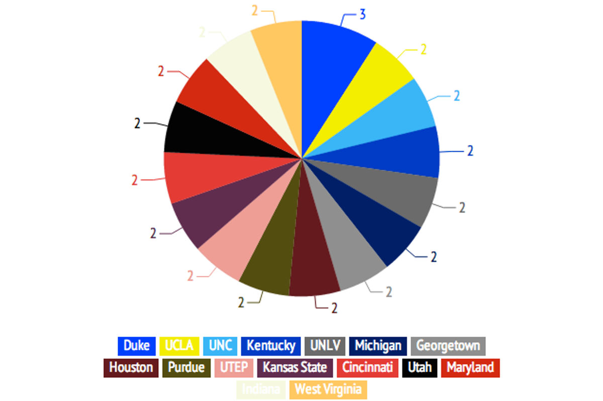
The pie chart above—from this otherwise solid look at the history of the history of the NBA No. 1 pick—shows the number of players taken first from each school, but only for schools that have had multiple players selected in the top spot. 16 schools appear on the chart, and 15 of them have had exactly two players selected. It's easy to poke fun at pie charts, but in this case, pretty much any chart would look goofy.
[ CBS]
Related


Latest Betting
- NBA Finals Game 2 Betting Picks and Predictions Spurs vs. Knicks
- MLB Picks Today: Two Sunday Bets Worth Backing
- MLB Predictions and Best Bets for Saturday's Biggest Games
- UFC Vegas 118 Betting Picks: Three Fights to Target on Saturday Night
- MLB Picks Today: Two Pitchers Set Up To Fall Short On Outs Props
- MLB Pitcher Props Today: Best Bets for June 3rd
- NBA Finals Game 1 Best Bets: Knicks vs. Spurs Predictions and Player Props